Where to Access
In order to access the dashboard, you should navigate to the Bango back office dashboard as normal. In the top right of the screen, there will be a tab in the top right called Insights. Click this to be taken to the new dashboard, as can be seen in the below image.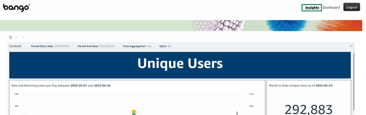
There may be issues with displaying some of the graphs if the cookie settings on your browser are not correct. Please make sure your 3rd party cookies are enabled if you are facing difficulties in getting the visuals to display
Please also note that this dashboard will be updated at 09:00 UTC each day. Until then, it will be displaying data for the previous day.
Navigating the Dashboard
Filters
Once in the dashboard, there is a series of filters at the top of the page, next to the title “Controls”. This will allow you to filter the data to show the time period and OpCo (or OpCos) that you are interested in. The filters in the control bar will alter data for the entire sheet, regardless of whether it is in the Unique Users or Error Metrics section. The control bar can be seen in the image below.
Screen Detail - Explanations
The dashboard is split into two sections in the current iteration - Unique Users and Error Metrics. The following section contains a PDF of the dashboard with a number assigned to each visual.The table below gives a description of what each visual is showing, as well as how it interacts with other visuals.