
Dashboard Components
Partner Selector
The Partner Selector allows you to switch between Merchants.
Timezone and last data refresh
The timezone and last data refresh indicator let’s you know which timezone the information in the dashboard is being displayed in and when was the last time the data was refreshed.
Date period selector
The date period selector is set-up to give you quick access to important time periods and covers the following time periods. Last 7 days, Last 30 days, Current Month, Previous Month, Last 3 Months, Last 6 Months and Last 12 Months.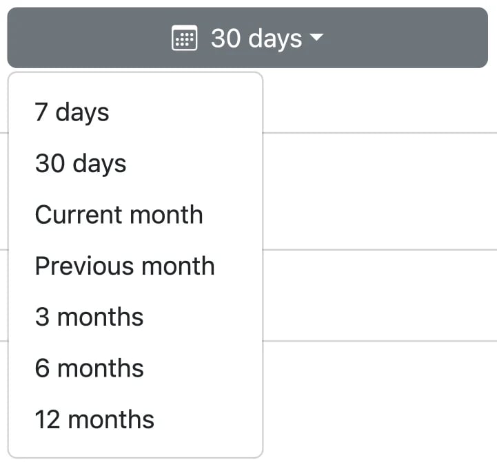
Top line Metrics
The Top Line metrics give you a quick snapshot on the performance of your route, it currently shows the following:- Net Sales in time period: Net Sales calculates the Total Captured amount in a period of time minus refunds.
- Avg. Spend: Average spend calculates the average captured amount per payment. This does not include partial captures

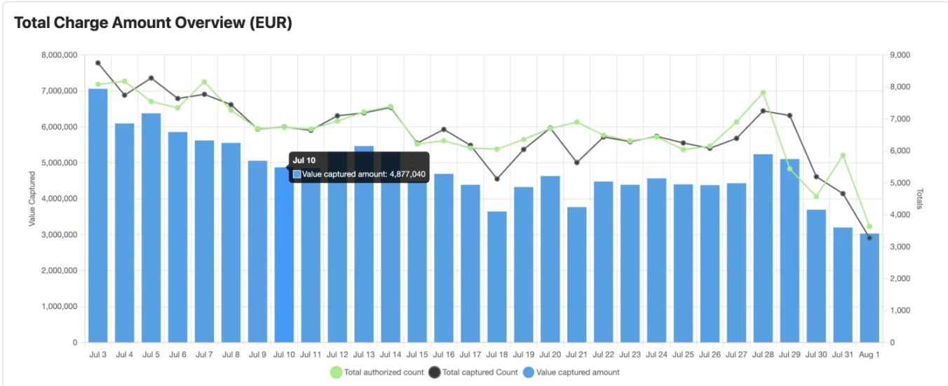
Total Charge Amount Overview
This graph has two y axis and shows you the total authorized count, the total captured count and the Total Value captured within the time period selected. It’s fantastic at giving you a clear view of what’s happened and helps you quickly identify trends and anomalies.